SVG Icons That Travel Bloggers Are Adding to Itineraries and Guides
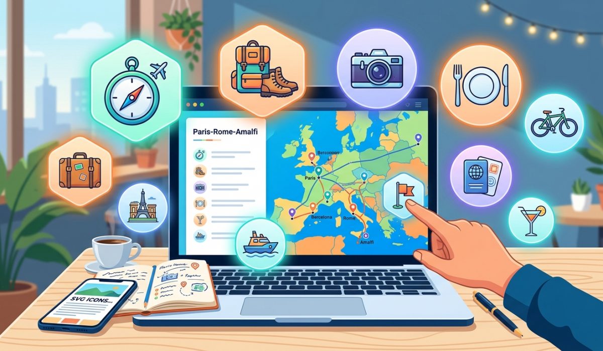
SVG Icons That Travel Bloggers Are Adding to Itineraries and Guides
If you have ever zoomed into a travel blog on your phone and watched a map icon turn into a blurry, pixelated mess, you already understand the problem. Travel bloggers and freelance itinerary designers put hours into building beautiful digital guides, only to see the graphics fall apart the moment a reader pinches to zoom or opens the page on a high-resolution display. The fix is not a bigger image file or a fancier image editor. The fix is a different file format entirely.
The resolution problem has a format-level solution. SVG icons scale to any size without losing sharpness, making them the practical choice for digital travel content across all devices.
– Raster images (JPG, PNG) degrade when scaled up, which is a persistent issue on retina screens and mobile zoom.
– SVG files are built from mathematical paths, so they stay crisp whether displayed at 16px or 1600px.
– Travel bloggers who switch to SVG report fewer image complaints and faster page loads, since SVG files are typically smaller than their raster equivalents.
Why Raster Images Fail Travel Bloggers
Most travel content is built around photography, and that is exactly as it should be. A stunning landscape shot of the Amalfi Coast belongs in JPG format. But icons, symbols, and map graphics are a completely different category. They are not photographs. They are line drawings, and line drawings have always been the native territory of vector graphics.
A PNG icon of a bus or a hotel bed is baked at a fixed resolution. When a reader on a 4K monitor opens your itinerary, the browser has to stretch that fixed-resolution image, and stretching pixels produces blur. The icon that looked sharp in your design software becomes soft and unconvincing on someone else’s screen.
This is not a new problem. The Scalable Vector Graphics format was developed by the W3C specifically to solve it. SVG files describe shapes mathematically, which means the browser recalculates the geometry at whatever size the display requires. The result is always sharp, always clean, and always consistent, whether the reader is on a 13-inch laptop or a 27-inch desktop monitor.
The Icon Sets Travel Content Creators Actually Need
Knowing that SVG is the right format is only half the answer. You also need icon libraries that actually cover the subjects travel bloggers write about. Generic icon packs designed for corporate software are full of charts, spreadsheets, and gear icons. They rarely include a cable car, a beach umbrella, or a regional train symbol.
That is where purpose-built collections make a real difference. A well-organized set of travel icons covers the full range of transportation modes, accommodation types, and landmark categories that appear throughout a typical itinerary. Instead of hunting across five different sites for a ferry icon, a hostel bed symbol, and a mountain peak marker, you pull from one consistent visual system. The icons match each other in weight and style, which matters a lot when they appear side by side in a guide.
Here is why visual consistency is worth thinking about seriously:
- Mismatched icons from different sources have different stroke weights, which makes a guide look cobbled together rather than designed.
- A unified set means readers build a visual vocabulary as they move through your content, which reduces cognitive load.
- Consistent icon style also signals professionalism to the brands and tourism boards that might eventually sponsor your content.
Building Route Maps and Waypoint Graphics
Route maps are one of the most engaging formats in travel content. Readers love a visual overview of a road trip, a hiking trail, or a multi-city itinerary laid out with clear waypoints and directional cues. The problem is that these maps require a very specific category of graphic: arrows, pins, compass roses, dotted route lines, and location markers.
This is where a dedicated collection of navigation icons becomes genuinely useful. Instead of trying to adapt a generic arrow or pin from a stock site, you get symbols designed specifically for the spatial storytelling that travel maps require. Waypoint markers in different shapes let you distinguish between starting points, rest stops, and destinations. Directional arrows tell the reader which way the route flows without requiring any explanatory text.
The practical workflow is straightforward. You download the SVG files, drop them into your design tool of choice, whether that is Figma, Adobe Illustrator, or even Canva, and they import as editable vector shapes. You can change the color to match your brand palette, adjust the size without any quality loss, and export them back out as SVG for the web or as high-resolution PNG for print.
Multi-Destination Roundups and the Flag Problem
Travel bloggers who write roundup posts face a specific visual challenge. An article covering ten countries in Europe, or six stops on a Southeast Asia backpacking route, needs a fast visual shorthand to help readers locate each country or region in their mental map. Text headings work, but a visual marker that readers recognize instantly is far more effective.
Country flags are one of those instantly recognizable markers. They carry an enormous amount of geographic information in a tiny space. Readers do not need to read the label. They see the flag and they know exactly where they are in the guide.
The catch is that flag graphics sourced from random corners of the internet are often low-resolution, inconsistent in size, or encumbered by murky licensing terms. A collection of SVG country flags eliminates all three problems. The files are vector, so they scale perfectly. They are built to a consistent aspect ratio, so they line up neatly in a grid or a list. And the licensing is clear upfront, which matters when you are building content that may be syndicated or licensed to other publishers.
Here is what consistent flag graphics do for a multi-destination guide:
- They give each section a distinct visual identity without requiring custom artwork.
- Readers scanning the article can locate specific countries without reading every heading.
- The visual rhythm of a flag, heading, and intro paragraph creates a repeatable structure that makes long roundups feel organized rather than overwhelming.
Page Speed Is Part of the Picture
There is a practical argument for SVG beyond resolution, and that argument is file size. High-resolution PNG icons can run to 50 or 100 kilobytes each. A page with twenty icons starts to add real weight, and page weight affects load times, and load times affect how Google ranks your content.
SVG files for simple icons are often under 5 kilobytes. The math is not complicated. Twenty SVG icons might add 80 kilobytes to your page. Twenty high-resolution PNGs might add 1.5 megabytes. That difference shows up in your Core Web Vitals scores, which the Google Search Central documentation identifies as a direct ranking factor. Faster pages rank better, keep readers longer, and produce better ad and affiliate revenue per visitor.
This is not a marginal gain. It is the kind of technical improvement that compounds across an entire site over time.
Practical Setup for Non-Designers
Not every travel blogger has a design background, and that is fine. The workflow for using SVG icons in digital content does not require professional design skills.
Most modern website builders, including WordPress with Elementor or Divi, Squarespace, and Webflow, accept SVG uploads natively. You download the icon, upload it through your media library, and insert it exactly as you would a JPG or PNG. The difference is that the file stays sharp at every size and the file size is typically smaller.
For bloggers who build custom itinerary PDFs or printable guides, SVG files work equally well. Design tools like Canva Pro, Affinity Designer, and Adobe Express all handle SVG imports without issues. The icons come in as fully editable shapes, which means you can change colors, resize elements, and combine symbols into custom compositions without starting from scratch.
The Format That Solves the Problem Travel Bloggers Keep Running Into
Travel content lives across a huge range of screens and contexts. A destination guide gets read on a phone in an airport lounge, on a laptop at a coffee shop, printed out and stuffed in a backpack, and screenshotted and shared on Instagram stories. Raster icons cannot hold up across all of those contexts. Vector icons can.
The shift to SVG is not a trend or a preference. It is a direct response to the way travel content is actually consumed. Bloggers who make the switch stop receiving reader complaints about blurry graphics, see improvements in page speed metrics, and find the whole design process faster because they are working from one cohesive icon library instead of assembling mismatched pieces from across the web.
The resolution problem that raster images created has had a clean, well-documented solution for years. SVG is that solution, and the icon libraries that cover travel content specifically make it more accessible than ever for bloggers who want their guides to look as good as the destinations they write about.